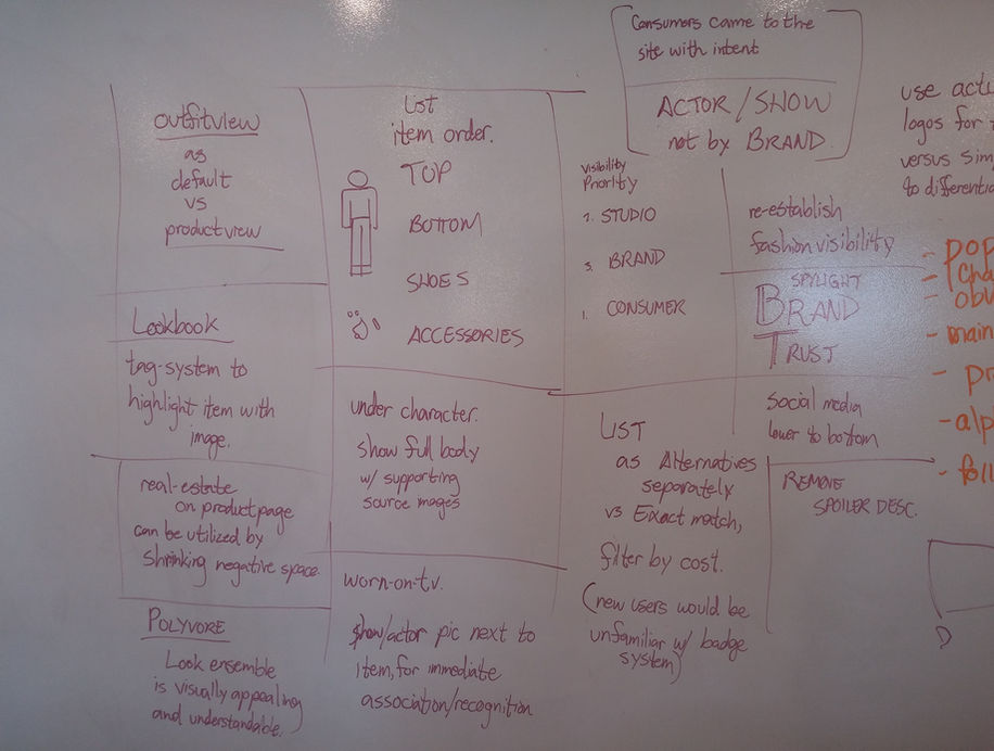
Competitive and comparative research
The team found that successful competitors communicated value more quickly and used image proximity and scale to strengthen association and comprehension.

Startup · entertainment commerce
I helped clarify a fashion-discovery product that connected what people watched with what they could buy—using research, product mapping, mobile-first design, and a sharper brand system.

Shorten the path. Clarify the product.
Experience at a glance
The original screen stack makes the product idea tangible before the process begins: connect entertainment, fashion discovery, and commerce while shortening the route to a desired item.


Analytics indicated low retention on Spylight’s main product hub. The initial brief was an interaction and UI redesign, but the deeper problem was product understanding: the experience mixed entertainment and fashion cues without making the commerce model clear.
Getting people to the target outcome in fewer steps became the central design constraint.
Team
3 core roles: UX/UI consultant, lead designer, project manager
Duration
5-month contract
Tools
Whiteboard, Photoshop, Illustrator, InVision, Axure
Methods
Competitive analysis, User interviews, User flows, Product mapping, Wireframes, Usability testing, Visual design, Prototyping
The challenge
Users could not immediately tell whether Spylight was a video-streaming service or something else. Reaching a desired item sometimes required navigating roughly five category filters, and the existing app felt clunky. Information architecture was therefore central to both comprehension and conversion.

We revised the website structure and shifted the experience away from reading primarily as entertainment media toward a clearer fashion-commerce product.
A mobile-first approach forced prioritization, reduced feature density, and helped the team focus on the minimum viable product before extending the desktop model.
Preliminary interviews and analytics existed, but the methods were inconsistent. I worked to establish more reliable procedures, then connected competitive research, product review, and guided user interviews.
The team found that successful competitors communicated value more quickly and used image proximity and scale to strengthen association and comprehension.

The page moved between app screens, clothing, and entertainment imagery without a clear onboarding story.

User interviews validated the difficulty of finding specific products and understanding whether an item was actually available.
Branding, information architecture, and product structure evolved together. Mobile-first work helped limit complexity; a physical app map made the cost of each path visible. When executives paused the app, the team redirected the established system into the desktop experience.
With staff approval, the redesigned website moved into development and release. An executive decision shifted focus away from launching the app at the same time.
The mobile-first work still gave us the architecture and priorities needed to assemble the desktop model quickly.